
Looking at accessibility - here are our top tips
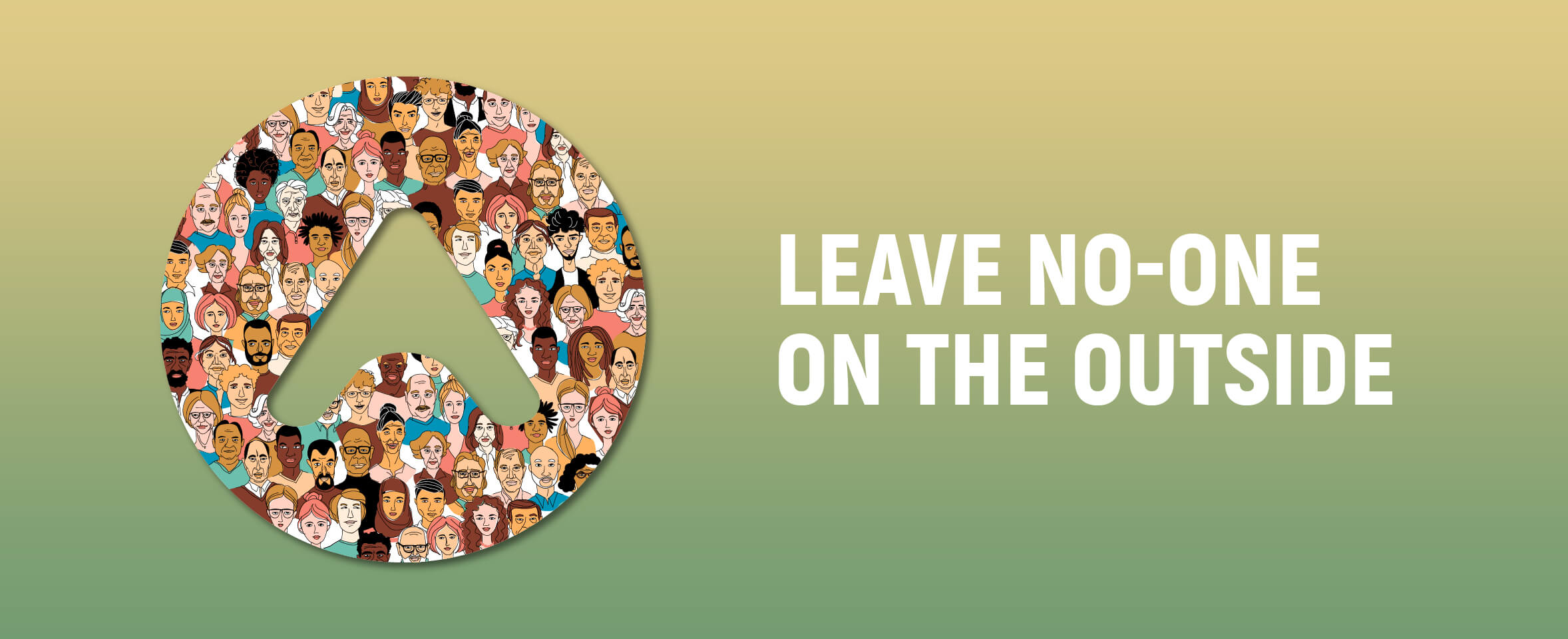
Accessibility is not a ‘nice to have’, it’s key to your culture and ethos and it formulates the way the business is perceived both internally and externally. Whether you are a site owner, designers, or developers we should not be looking to shoe-horn in quick fixes. Getting it right not only meets the needs of so many people, but also has the power to make their day to day lives a little bit easier. Every brand strives to deliver simplicity.
Many of the actions are actually very easy to implement. So, we have put together some top tips to help you see things differently and to understand the WCAG (Web Content Accessibility Guidelines) better.
Sub-Headings
Page headings inform the user what they can expect to find on the page but by adding sub-headings to the content you help to break up the page, add interest and improve navigation for everyone, particularly for those using assistive technologies.
Adding sub-headings will be a small change but by doing so you will make your site more accessible for anyone unable to navigate webpages using a mouse. Working only with the keyboard, users can jump focus from heading to heading, and screen readers can bring up a list of headings and sub-headings that allow the user to quickly jump to the content they need. It is also beneficial to those with cognitive and learning disabilities, enabling the user to digest your content in a variety of ways.
Sub-headings go beyond aiding the accessibility of your site, by breaking up the content with headings it enables everyone to quickly find the content they are looking for, creating a better user experience.
It also facilitates SEO, as search engines can now more easily determine the content that is on each page.
Avoid all caps
Using all caps to stylise our headings and paragraphs has become commonplace, but have you ever stopped to consider it may be an accessibility issue?
There are two issues with this: All caps make it harder for anyone with reading comprehension challenges; And many assistive technologies will read out all caps word letter by letter – which is not how you intended it to be read and diminishes its efficacy!
Next time you look to go all caps on your site, think about what it’s going to achieve and consider all the disadvantages.
Disabled Buttons
So, you've greyed out your disabled form button because the user has yet to complete all the required form fields, or the data they have added is incorrect?
The visually impaired rely on screen readers to navigate your site, a disabled button causes some assistive technologies to not focus on the button, meaning that there is no way of knowing it has been disabled. And if our user is not using assistive technologies but has impaired vision greying out a button can make it very difficult to read any text in the box due to a lack of contrast.
Keeping the button as normal, and just providing a message after the user has clicked the button would be far more inclusive.
In fact, WCAG interactive UI components like buttons do not need to meet colour contrast minimum criteria. So just meeting the WCAG requirements will not necessarily make your site fully accessible, you need to go a little further to fully achieve this. Like many guidelines, it is a living document, and new criteria are added with every revision.
All or nothing
When reviewing accessibility issues on existing sites, a common mistake is to only amend the quick fixes.
The text may now be readable on your site with the help of assisted readers, but what use is that if they still cannot add items to their cart to buy your products? You need to ensure your whole user path is accessible, otherwise you risk frustrating people even more. Personally, I often rely on subtitles and recently I made my way through a video series only to reach one close to the end that did not have captions – this was beyond frustrating.
Meeting one criterion within the WCAG, does not necessarily mean a new group of people can now access all your content. The guidelines to help specific disabilities, or those with a certain method of navigation, may be spread across multiple criteria. You need to look at the whole picture to ensure you fix as many accessibility issues as possible on your site and not just take shortcuts!
Full accessibility for all is something that I strongly believe in, and Arthaus fully supports my desire to learn more and enable the team deliver better solutions. So, if I have inspired you to act but you are not sure where to start.
SHARE THIS POST